

This project is not in affiliation with New Balance and is a representation of my own creative thinking.
Project Statement
To design a lifestyle footwear product for the next generation of skateboarding athletes that has a modern look with performance aspects such as durability, impact protection, and overall comfort.


01
Inspiration
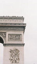
The inspiration behind this silhouette was predominantly taken from 90s street culture, urban architecture, and skateboarding groups who revolutionized the sport for what it is today. Taking design elements from the past and blending them with the future to create the next iconic silhouette.
02
Activities
The next generation of skateboarding athletes prioritizes multi-functional components such as leisure, competitive events, and social gatherings. Each of these elements are woven into the design inspiration of this silhouette, allowing for a dynamic footwear product which can be applicable in any situation.


03


Problems
While diagnosing problems relating to current day skateboarding silhouettes the primary issues I observed were inadequate structure, outdated technology and aggravating discomfort occuring while riding. I choosen to focus on these issues because as technology advances so should innovation and this was important during my design process.
04
Solutions
My silhouette takes into account the New Balance identity and what the brand stands for, so through this I achieved exceptional detailing, a timeless piece with hints from iconic silhouettes and an alleviating ride for each skater no matter the skill level.


05
Ideation
Throughout my design process I wanted to focus on a low profile design with construction details that reinforce high impact areas for many riders. With this silhouette longevity and a unqiue design were in my core design process because the purpose of this silhouette was a multi-functional design.
06
Final Ideation Concept
The final design is meant to represent young skaters and their outlandish style which is shown through their personality. Each component has a purpose and through this allows the skater to perform at their max potential while feeling comfortable and confident as well.


07
Final CAD Renders
Demonstrated here is my fine line art work which was completed in Adobe Illustrator and shown are all the orthographic view points allowing others to easily destinguish key points such as stitching, outsole traction, New Balance logos (one on the lateral side and the other on the tongue) and other important key features.
08
Construct Details & Materials
Numeric skate silhouettes should be rooted in durable and long lasting materials and a few I researched and implemented into my design are, Cordura AFT which is a knit mesh which is highly breathable and has a high tensile strength allowing for enhanced abrasion resistance. Also New Balance uses Fuel Cell foam which is great for impact protection and a comfortable ride during long durations. Last I chose to emphasize the ThermoPlastic rubber which is covering all the high impact points while riding and performing aggressive tricks and with a clear rubber you are not constricted from observing what the rest of the silhouette has to offer.


Compassion

Expression

Freedom
09
Color Stories
Each color story has a purpose and this drives the consumer to truly value what they have on their feet. The first colorway represents compassion: each skater holds a strong connection to the sport and through their compassion their stories are told, so I chose to highlight this with different shades of green and partner them with black and ivory. The next color story is expression: marked by a triadic color strategy including ocean blue, taxi yellow and blood red, which allows skaters to express their creativity. Freedom represents the last color story and explores an individuals freedom when it comes to how they feel when they are on their board, with colors such as deep maroon, laverander purple and burnt orange.
10
Final CAD's with Color

Compassion
I chose to experiment with different color ratios with Adobe Illustrator to help explore alternate colorways and creatively address new ways in which can catch the eye. Color strategy is very important during the design process as it leads into consumer research and how the consumer will gravitate towards certain colorways and what they will resonate with the most. So with that being said, here are multiple colorways which resonate with my consumer.

Expression

Freedom


11
3D Render Perspectives - Gravity Sketch
Gravity Sketch played a tremendous role in allowing me to demonstrate my creativity and bridge the gap into the 3D design space. This process allows me to correct any mistakes I may have encountered during the ideation process and also provide a realistic 3D rendering which is necessary when identifying key elements consumers could potentially gravitate towards.
12
Final Render 3D
Over the course of this project I wanted to keep in mind this silhouette was directed towards young skaters who wanted somethings to live for when they rode and felt free while doing so, each aspect of this silhouette was meant to represent longevity through sustainable thinking practices and strategic material use. This helps to reduce overall waste by having such a multi-functional design meant for anyone, anywhere and under any condition.
